What Should a Small Business Website Actually Include?
Fewer pages than you think, and more clarity than most sites have. Here is what a small business website needs before anything else, and what can wait.
A small business website needs fewer pages than most people expect and more clarity than most sites have. Before anything else, it needs a homepage that says what you do and where, a page for each main service, real proof of your work, and one obvious way to get in touch. Everything beyond that should earn its place.
The actual problem
Most small business websites are built from a template’s idea of a website. There is a slider, an about page, a contact form and maybe a blog that stopped a few years ago. They look finished, but they do not answer the questions a customer has when they arrive.
People rarely land on a small business site to browse. They come with a problem or a plan, usually on a phone, and they are deciding whether you are the right call. If the site makes them hunt for the answer, they go back to the search results and the next business gets the chance.
What a small business website actually needs
A homepage that answers three questions fast
What do you do, who and where do you do it for, and what should the visitor do next? If someone cannot tell within a few seconds of landing, the rest of the page does not get read. Clever headlines are fine, as long as the plain answer sits right next to them.
A page for each main service
Give every main service its own page, written around what customers ask before they buy: what affects the price, how long it takes and what happens first. These pages also do most of the work in search, because people search for the specific thing they need, not for a business in general.
Proof
Reviews, real photos of real work, project examples, licenses and years in business. Proof is what turns “they say they’re good” into “they’re good.” Stock photos work against you here, because visitors can tell, and it makes them wonder what the real work looks like.
Clever headlines are fine, as long as the plain answer sits right next to them.
One clear next step, on every page
A phone number you can tap on a phone, a short form and a button that says what actually happens, like “book a visit” or “request a quote,” instead of “submit.” Decide what you most want a visitor to do, then make that the easiest thing on the page.
The quiet basics
Fast loading on a phone, readable text, a secure connection, page titles and descriptions written for search, and the same business name, address and phone number everywhere they appear. Nobody compliments these details, but everyone notices when they are missing, including Google.
A way to know what is working
Forms and calls should tell you where each lead came from. Without that, you are guessing which marketing is paying for itself. The marketing ROI system we built started from exactly that question.
What can usually wait
A blog you will not keep up with. A separate page for every small variation of a service before the main pages are right. A chat widget nobody answers. Heavy animation that slows the site down on a phone. None of these are bad ideas on their own, but each one adds something to maintain, and none of them matter if the essentials are missing.
Common mistakes
- Writing about the business instead of the customer. “We are passionate about quality” is something every competitor can say. “Written prices before any work starts” tells a customer something they can hold you to.
- Making people work for the basics. Hiding the phone number, the service area or any sense of what things cost sends visitors somewhere that answers them faster.
- Designing for a desktop screen first. Most visits to a local business happen on a phone, so the phone version is the real version.
- Launching and walking away. A site that never changes slowly drifts out of date: old photos, old hours, services you no longer offer.
What this means for your business
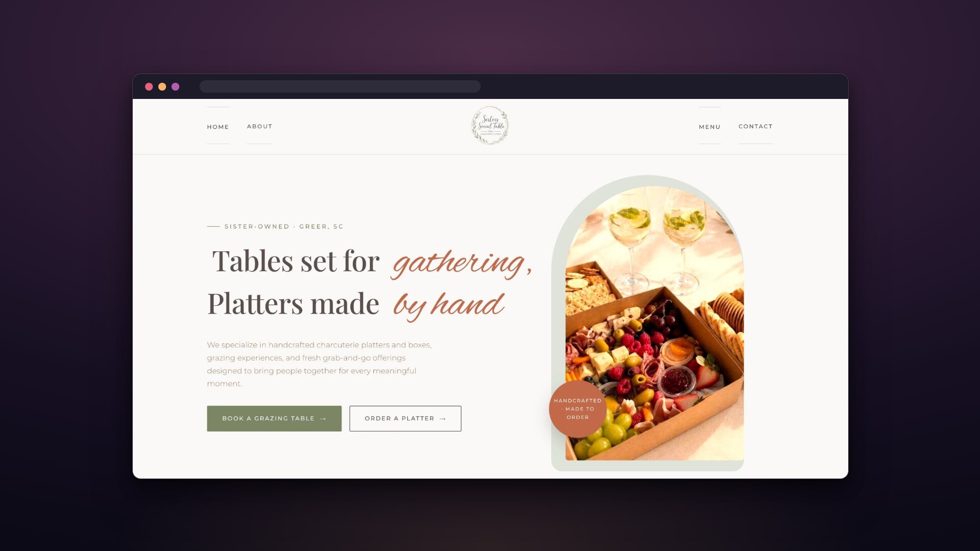
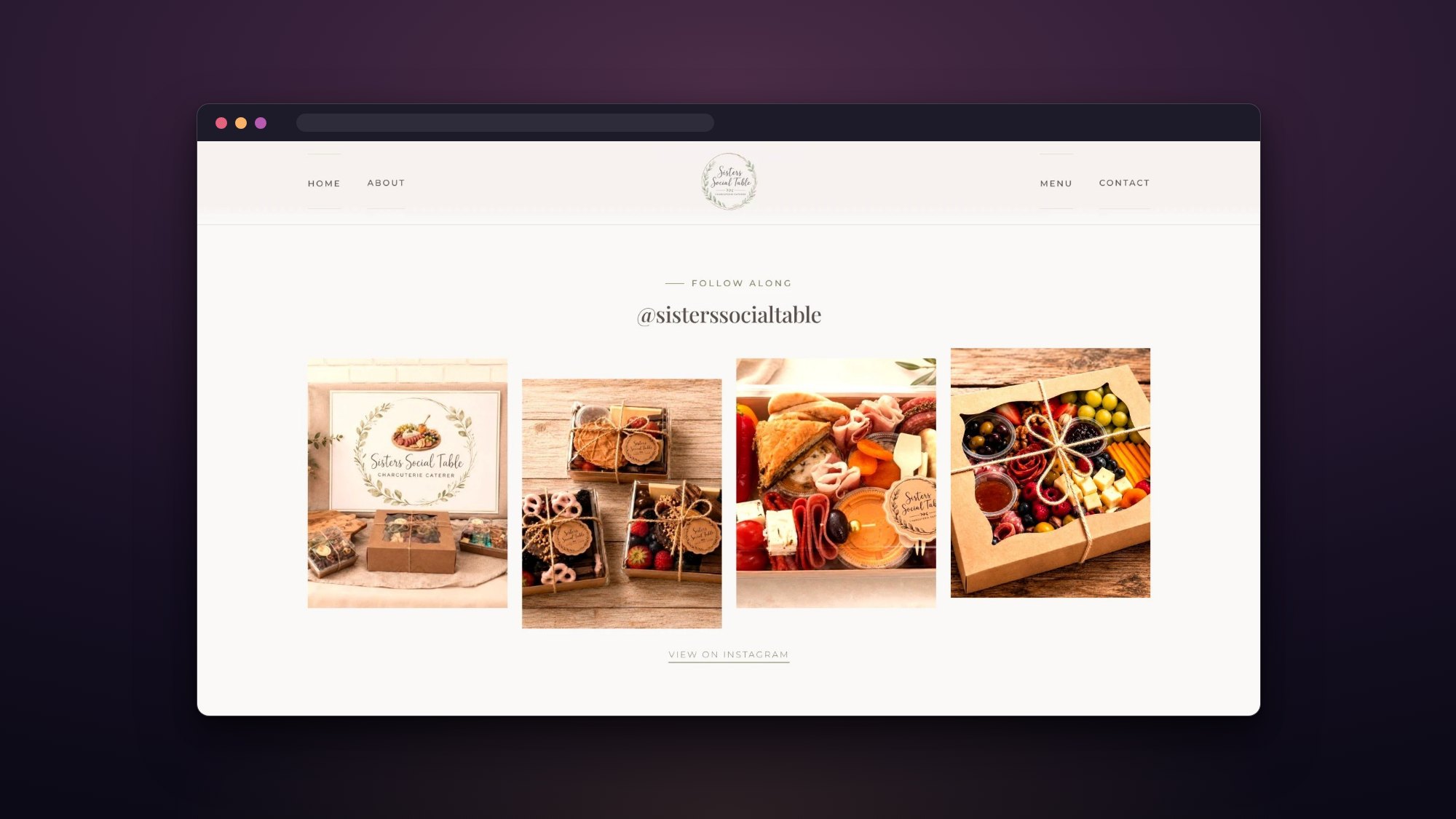
Start by checking whether the essentials are there and doing their job before adding anything new. On the Sisters Social Table website, the two orders people come for most, a grazing table or a platter, sit in the very first screen, so nobody has to dig through a menu to book. The idea is not complicated. It comes from asking what a visitor is trying to do and removing everything in the way.
If you are planning a site, it also helps to read what to prepare before hiring a web designer. When you are ready, you can see how web design works at Duskwork, or tell us about your project.
more from the journal
When Is It Time to Redesign Your Website?
Age alone is not a reason to redesign. These are the signs that your website is actually costing you business, and the problems a new design will not fix on its own.
What to Prepare Before Hiring a Web Designer
A little preparation makes a website project faster, cheaper and better. Here is what to gather before you talk to a web designer, and what you do not need to have figured out.
Logo Design vs. Brand Identity: What’s the Difference?
A logo is one mark. A brand identity is the system that makes everything you put out look like it came from the same business. Here is the difference, and when each one is enough.