Logo Design vs. Brand Identity: What’s the Difference?
A logo is one mark. A brand identity is the system that makes everything you put out look like it came from the same business. Here is the difference, and when each one is enough.

A logo is a single mark: the symbol or wordmark that stands for your business. A brand identity is the whole system around it, including the colors, type, voice, photography style and rules that make everything you put out look like it came from the same place. A logo is part of a brand identity. On its own, it is not one.
The actual problem
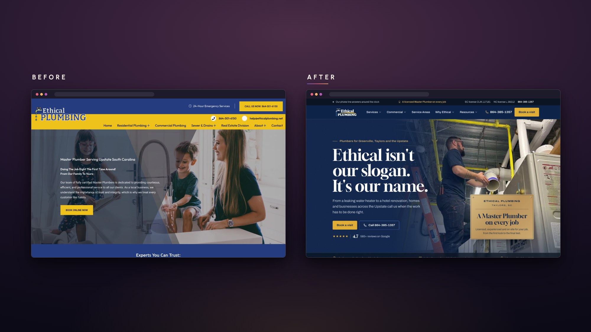
Many businesses ask for a logo when what they actually need is an identity. They get a nice mark, then every new thing gets designed from scratch: the website by one person, the truck wrap by another, the social posts by whoever has a free afternoon. Each piece uses the logo, but the colors drift, the fonts change and the tone shifts from formal to casual and back.
Customers notice, even when they cannot say why. A business that looks a little different everywhere it shows up feels less established than it is, and that costs trust at exactly the moment you need it.
With a logo alone, they guess. With an identity, the decisions are already made.
What each one includes
Logo design
- A primary logo
- Versions for different spaces, like a stacked version, a horizontal one and a small icon
- Files in the formats you need for print and screens
That is a useful starting point, and for a brand-new business on a tight budget it can be the right first step.
Brand identity
A brand identity starts with the logo and adds everything needed to use it consistently:
- Color: a primary palette and supporting colors, with exact values for print and screens
- Typography: the fonts for headings and body text, and how they are used together
- Voice: how the business sounds in writing, from the website to a text message
- Imagery: what photos and graphics should look like, and what to avoid
- Guidelines: a practical guide that shows anyone working on the brand how to use all of it
The difference shows up the first time someone other than the designer has to make something. With a logo alone, they guess. With an identity, the decisions are already made.
Common mistakes
- Treating the logo as the whole brand. A great logo set in the wrong colors on a cluttered flyer still looks off.
- Choosing everything by personal taste. Your favorite color is a fine starting point, but the identity has to work for your customers and stand apart from your competitors.
- Skipping the guidelines. Without them, the identity lasts until the first rushed deadline.
- Rebranding when a refresh would do. If people already recognize your mark, cleaning it up and building a system around it often beats starting over.
What this means for your business
If you are just starting out, a solid logo with a simple color and type choice can carry you for a while. If you already have a logo but your website, print and social media all look a little different, the logo is not the problem. The missing system is.
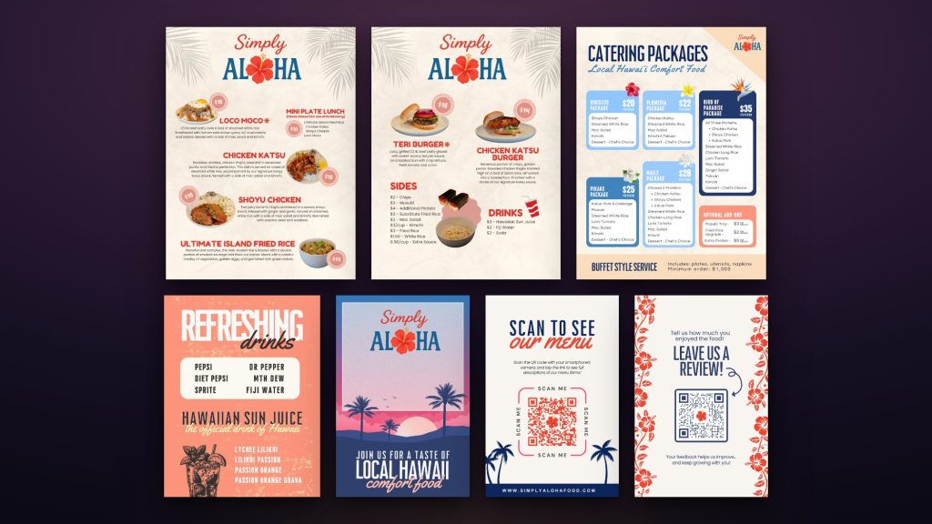
You can see what a system does in practice in the Simply Aloha menus: the menus, table cards and signs share one palette and one set of type, so every piece on the counter looks like it came from the same kitchen. If you want to see what a full identity includes, read what goes into a complete brand identity.
When you are ready to build one, here is how brand identity works at Duskwork. Or start a project and tell us where your brand is today.
more from the journal
What Goes Into a Complete Brand Identity?
A complete brand identity is more than a logo and a color. Here is every piece, what each one does, and which ones a small business needs first.
What Should a Small Business Website Actually Include?
Fewer pages than you think, and more clarity than most sites have. Here is what a small business website needs before anything else, and what can wait.
When Is It Time to Redesign Your Website?
Age alone is not a reason to redesign. These are the signs that your website is actually costing you business, and the problems a new design will not fix on its own.